Stateful UI
Stateful UI is a React component library built on Base UI and styled with Stateful CSS, a CSS methodology I am developing for managing component variants, interaction states, and design-system rules in a more predictable way. The library serves both as a practical set of accessible components and as a working example of how Stateful CSS can scale across real interface patterns.
Problem
Component libraries often become difficult to maintain as states, variants, sizes, themes, and accessibility requirements expand. Styling rules get scattered across component files, utility classes, data attributes, and one-off exceptions. Documentation may show the happy path, but edge states such as disabled, active, selected, invalid, loading, or focus-visible are often inconsistent or incomplete.
Context
Modern React teams increasingly rely on headless or unstyled primitives for accessibility and behavior, then build their own styling systems on top. Base UI provides a strong foundation for accessible components, but teams still need a clear methodology for expressing state, hierarchy, and visual variation. Stateful UI explores that layer: how a component system can make state visible, consistent, and easy to reason about through CSS.
Solution
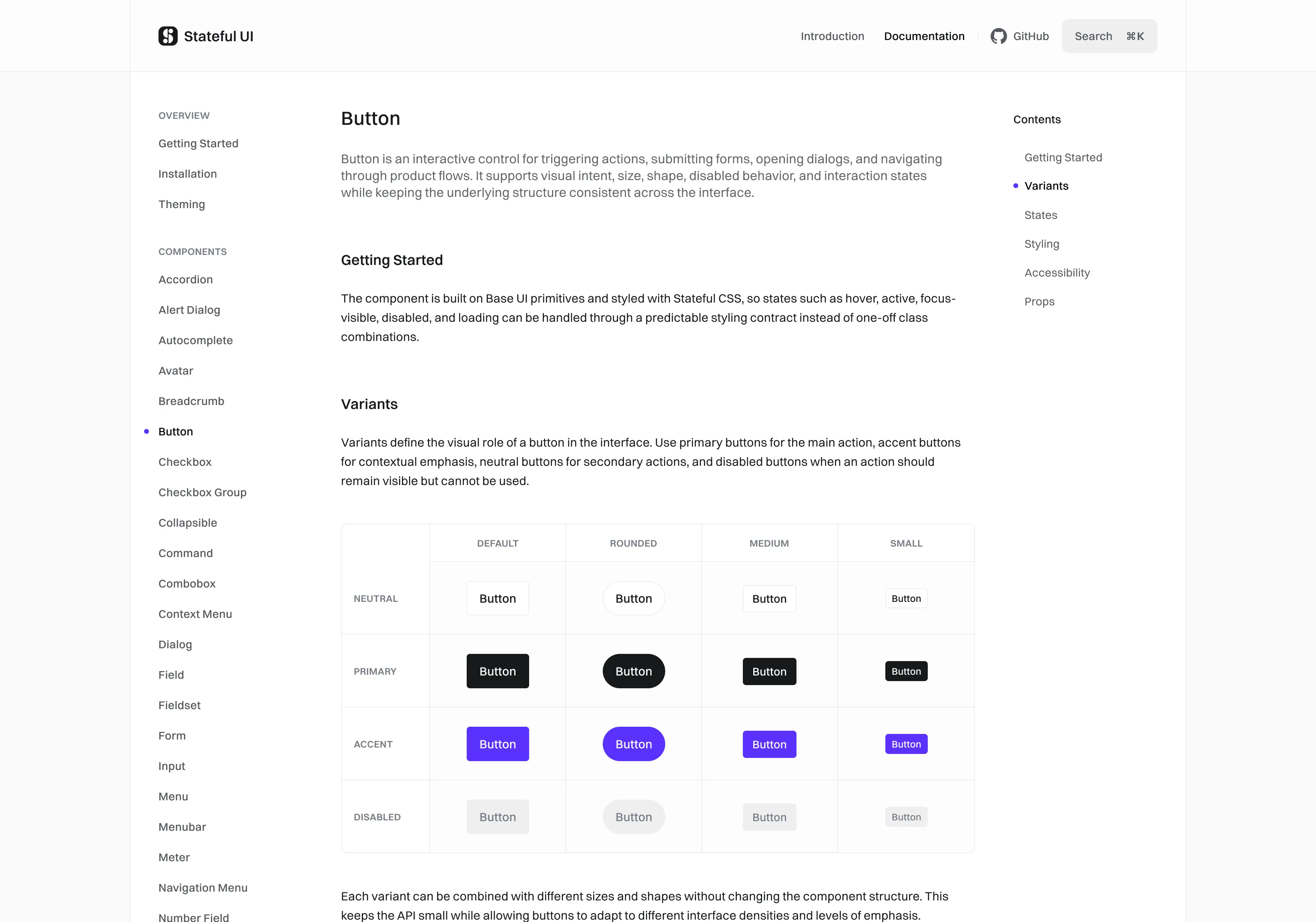
Stateful UI combines Base UI primitives with Stateful CSS conventions to create accessible, documented React components with predictable variants and states. Each component is designed around a clear styling contract: intent, size, shape, interaction state, and theme behavior are represented consistently across the library. The project begins with React and Base UI, with the component library acting as both a usable interface kit and a reference implementation for the underlying CSS methodology.